
MobileVersion orResponsiveDesign?
The latest trend on the internet is responsive web design. It seems like everyone is talking about it this year.
The main advantage of responsive design is its versatility and flawless display across various devices: laptops, smartphones, and wide-screen monitors. You no longer need to build multiple versions for each specific screen size. A responsive website will work seamlessly on any device with internet access.
A site that automatically adapts to any screen diagonal often surpasses the capabilities of a standalone mobile version. However, sometimes a dedicated mobile site remains the best solution for specific niches: restaurants, banks, and jewelry stores. These audiences are more demanding, expecting rich functionality, dynamics, and animations.
Why will Google lower website rankings? Responsive design or mobile version? And why did you choose Lpg.tf?
We will answer these questions right now.
Google always cares about its users. With the growing number of people accessing the web via mobile devices, there was a pressing need to make this process even more convenient. To ensure a smooth user experience on smartphones, Google
will start prioritizing mobile-friendly websites beginning April 21st.
To stay ahead of the competition, prepare in advance:
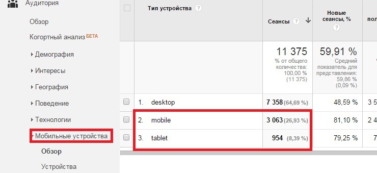
- Log into Google Analytics and determine what percentage of your visitors access your site from mobile devices.
- Then, take the test using this link — https://www.google.com/webmasters/tools/mobile-friendly/. By analyzing your website, you will see exactly how mobile-friendly it is.
Users browsing from their smartphones typically have very little time for online surfing. That’s why mobile adaptation is absolutely essential for restaurants, auto repair shops, coffeehouses, and gas stations.
After all, when a car breaks down or a traveler gets hungry, they won't spend hours digging through the internet. They will go to the diner whose website loads correctly, allowing them to view the menu and prices without any hassle.
If a user encounters frustrating horizontal scrolling, long load times, or non-clickable elements, it’s much easier for them to leave your site and go (most likely) straight to your competitor.
Only established brand websites or platforms that users visit frequently can afford to relax. A non-responsive design won't scare away highly loyal customers.
Everyone already understands that an increasing number of people are going online from mobile devices. The question remains: mobile version or responsive design?
There is no definitive answer. Large corporations like Toyota Motor, Allianz, and Ford Motor have invested in creating dedicated mobile versions. Meanwhile, giants like Apple, Microsoft, and PayPal opted for responsive web design.
A mobile version is a separate website that automatically launches when a user visits from a mobile device.
The positive aspects of a mobile site shine if you run a blog or, for example, a bank. The goals of a desktop user and a mobile user differ slightly. A mobile user most likely wants to quickly find a phone number or address; they won't download heavy documents filled with statistical data and complex terms.
Therefore, when creating a mobile version, it’s crucial to pay attention to these specific user intents.

The main drawback of a mobile version is that updating content takes twice as much time. You basically have to manage two separate sites. Often, businesses that choose a mobile version forget to update it. As a result, the main website might promote a “spring collection”, while the mobile site still features “New Year discounts”. So, if your site requires frequent content updates, responsive design is a much better fit for you.
Responsive design is a web design approach that ensures your website displays correctly and accurately across all possible mobile devices.
A responsive layout adapts flexibly to any mobile screen size. It allows you to hide or transform specific elements, narrowing all content into a single, long page that is easy to scroll down. The key is finding the perfect balance.

A user arriving from a mobile device is almost no different from a desktop visitor (though there are exceptions depending on the site's niche). They are just as curious and want to know all the details.
Consequently, you need to provide them with the full content—whether it's product ingredients, a training program, or service descriptions.
The main disadvantage of responsive design is its rigidness. While a mobile version can simply be turned off (redirecting users to the full desktop page), a responsive design has to be completely rebuilt if the layout proves inconvenient or blocks access to critical elements.
All landing pages created on the Lpg.tf platform are fully responsive, display correctly on smartphones, and automatically adapt to all modern devices. Responsive pages significantly increase your audience reach.
Your users will be able to easily view all information in a convenient single-column layout. And smoothly submit their requests.


