
10 техник увеличения конверсии, которые подойдут любому лендингу
Сегодня мы расскажем вам о 10 элементарных и проверенных способах увеличения коэффициента конверсии, которые «работают» для абсолютно любого лендинга.
1. Забудьте про карусель
Вы когда-нибудь просматривали до конца все слайды на каком-нибудь сайте за исключением собственного? Думаем, ответ в большинстве случаев будет отрицательный. Тогда стоит ли ожидать этого от посетителей вашего лендинга? Как показывает статистика, 80-90% всех кликов приходится на первый слайд. Очевидно, что нет смысла тратить свое время и энергию на создание остальных.
Ко всему прочему, чем больше имеется вариантов выбора, тем дольше длится процесс принятия решения. Это называется параличом выбора (choice paralysis). Когда перед человеком один за другим мелькают различные варианты, он, как правило, совершает меньше переходов, чем если бы ему был доступен лишь один слайд.
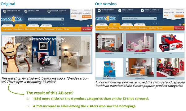
Первоначальная версия сайта интернет-магазина детской мебели содержала карусель, состоящую аж из 13 слайдов! В измененном варианте карусель была заменена 6 статичными изображениями наиболее популярных категорий продуктов.
В результате число кликов увеличилось на 188%, а продажи — на 75%.
2. Нет большим хедерам!
Часто веб-дизайнеры делают хедеры, или верхнюю часть сайтов весьма объемными, размещая в них довольно круглый логотип, бесконечную панель навигации (navigation bar) и огромное изображение. В результате по-настоящему важный контент страницы отодвигается на второй план, а все внимание людей сосредотачивается исключительно на верхней панели.
Переходя на ваш лендинг, люди в первую очередь ожидают увидеть то, что вы им предлагаете: ваши продукты, услуги, ответы на вопросы, связанные с поддержкой и т.д. Большая верхняя панель и меню навигации могут выглядеть довольно привлекательно, но для ваших посетителей этого мало. Уменьшите размер вашего хедера, и успех вам гарантирован.
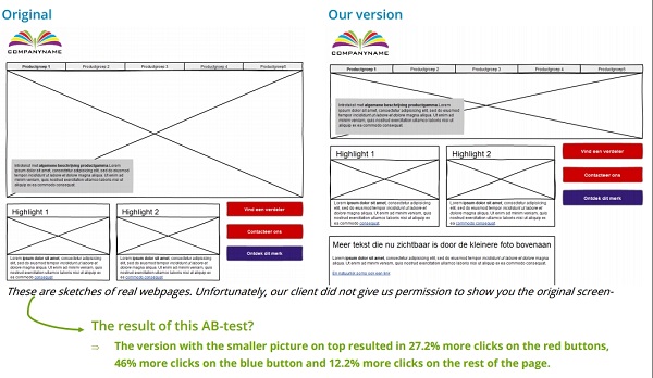
Перед вами эскизы реальных веб-страниц. В результате уменьшения изображения в верхней части страницы число переходов по красным и синим «призывам к действию» увеличилось на 27,2% и 46% соответственно, а по остальным элементам страницы — на 12,2%.
3. Побуждайте посетителей к действиям
Любой лендинг должен побуждать посетителей на разного рода действия:
- Подписаться на новостную рассылку
- Запросить информацию по продукту
- Найти ближайший магазин
- Рассчитать цену товара или услуги и т.д.
Делать это с помощью лишь одной большой кнопки, перенаправляющей на форму регистрации, запрос предложения, систему поиска магазина или калькулятор цен — не лучшая идея.
Вместо этого сразу же интегрируйте первый шаг регистрации на страницу. Если ваша форма состоит только из одного-двух полей, то включайте ее в полном объеме.
Так вы сможете лучше привлечь внимание посетителей.
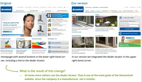
Первоначальная версия этого сайта (слева) содержала несколько кнопок в правом нижнем углу, включая ссылку на систему поиска дилеров. В измененной версии эта система была непосредственно размещена в правом верхнем углу, в результате чего пользоваться ее стали в 23 раза чаще.
4. Давайте пользователям четкие указания
Пожалуй, один из самых основных принципов юзабилити — чем легче что-либо в применении, тем чаще оно будет использоваться.
Ссылка всегда должна выглядеть как ссылка. Пользователям должно быть ясно, когда элемент кликабельный.
Ссылки подобны дорожным знакам на перекрестках. Они должны направлять ваших посетителей к месту назначения. Показывайте вашим посетителям путь и говорите им, что делать. Тогда вы и ваши потенциальные клиенты достигнете своих целей гораздо быстрее.
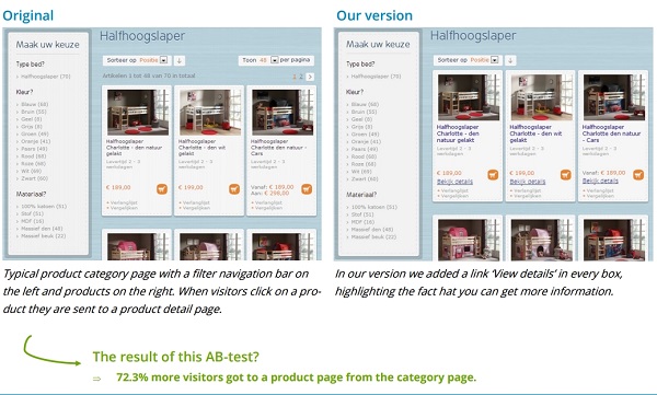
Слева на изображении представлена типичная страница категорий товаров, где панель с фильтрами расположена в левой стороне, а сами товары — справа. Кликая по изображению того или иного продукта, посетитель переходит на страницу с его детальным описанием.
В измененной версии этой страницы (справа) к каждому товару была добавлена ссылка «Подробнее», акцентирующая внимание посетителя на том, что он может получить больше информации по интересующим его позициям.
В результате данного изменения число переходов на страницы продуктов возросло на 72,3%.
5. Процесс выбора должен быть легким
На страницах с похожими продуктами (например, тв/интернет-тарифы, туры и т.д.) очень важно помочь посетителям как можно быстрее выбрать подходящий для них вариант, те решения, которые лучше всего отвечают их потребностям. Для этого необходимо предоставить достаточно информации о каждом товаре на обзорной странице.
Лучший способ выяснить основные критерии принятия решения ваших посетителей — провести пользовательское исследование (user research). Чем лучше вы знаете и понимаете желания ваших (потенциальных) клиентов, тем больше продаж у вас будет.
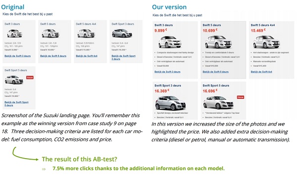
В первоначальной версии целевой страницы Suzuki выше для каждой модели автомобиля были перечислены 3 критерия принятия решения: расход топлива, выбросы CO2 и цена. В измененном варианте мы видим, что, во-первых, изображения были увеличены, сделан акцент на цене, а также добавлены дополнительные характеристики (дизельное топливо или бензин, механическая или автоматическая коробка передач).
В результате расширения информации о продукте число переходов увеличилось на 7,5%.
6. Используйте маркированные списки
Обычно текст на веб-страницах оформляется в виде длинных предложений в абзацах, что не совсем удобно для чтения.
Намного эффективнее работают маркированные списки — они очень наглядны, позволяют бегло просмотреть информацию и, помимо всего прочего, облегчают процесс сравнения разных товарных позиций.
При этом стоит отметить интересный факт: списки с нечетным числом элементов оказывают более сильное воздействие, чем с четным.
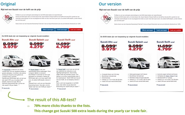
Благодаря оформлению текста в виде маркированного списка количество кликов увеличилось на 78%. Это изменение принесло компании 500 дополнительных лидов во время ежегодной торговой выставки автомобилей.
7. Добавьте убеждающее сообщение к каждой кнопке
Излишне говорить, что многие люди испытывают некоторые сомнения в тот самый момент, когда собираются нажать на кнопку, чтобы подтвердить заказ или подписаться на рассылку.
В таких случаях преодолеть эту нерешительность им поможет напоминание о той выгоде, которую они получат после совершенного действия. Отлично справляется с этим сайт Booking.com:
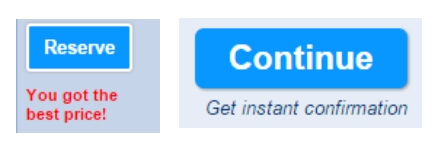
Кнопка слева: «Забронировать». Подпись ниже: «Это самая лучшая цена»
Кнопка справа: «Продолжить». Подпись ниже: «Получить мгновенное подтверждение»
Также вы можете предоставить людям возможность совершения другого действия. Например: кнопка «Забронировать номер сейчас» и ниже под ней ссылка «Или добавить в избранное».
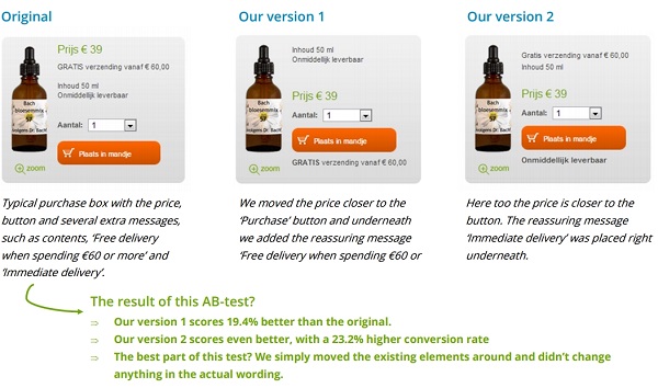
В результате добавления надписи «Бесплатная доставка при заказе от 60 евро» под кнопкой «Добавить в корзину», показатель конверсий увеличился на 19,4%. А сообщение «Мгновенная доставка» привело к еще большему увеличению — на 23%.
8. Повторите призыв к действию в самом низу страницы
Чем глубже посетитель прокручивает страницу, тем больше его заинтересованность. Если он доходит до самого конца, можно не сомневаться в том, что он практически на 100% убежден в том, что вы ему предлагаете.
Все, что вам нужно сделать на данном этапе, — это побудить его к совершению действия с помощью соответствующего призыва к действию.
Так, на сайте IBM 70% всех лидов приходят через призывы к действию, размещенные в нижней части страницы.
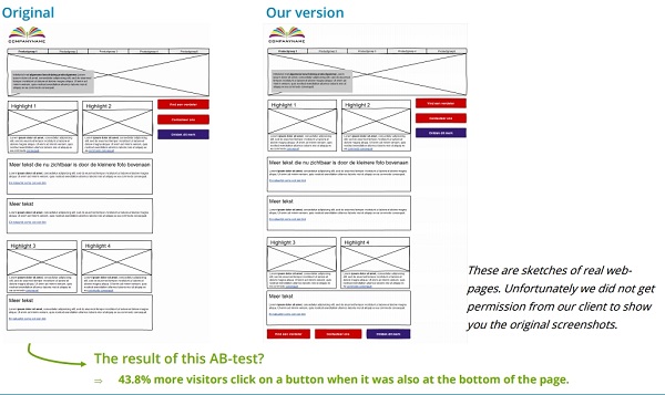
В результате размещения элемента призыва к действию также внизу страницы количество кликов увеличилось на 43,8%
9. Обоснуйте необходимость ваших полей
Как правило, люди испытывают сомнение прежде, чем предоставлять вам такие личные данные, как email, домашний адрес, телефонный номер и др. Поэтому вы должны объяснить им, для чего вам необходима та или иная информация.
Booking.com прекрасно иллюстрирует данный совет. Сообщение «На этот адрес придет подтверждение» четко говорит посетителям, почему им нужно указать свой адрес электронной почты:
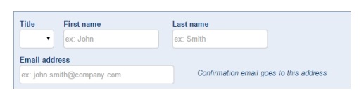
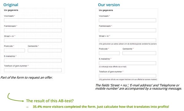
В результате добавления сообщений к полям «Улица и номер дома», «Email-адрес», «Городской или мобильный номер», обосновывающих необходимость этих данных, количество заполненных форм увеличилось на 35,4%.
10. Объедините все эти советы для наилучшего эффекта
Чем больше техник, описанных в этой статье, вы примените, тем выше будут ваши показатели конверсии в итоге.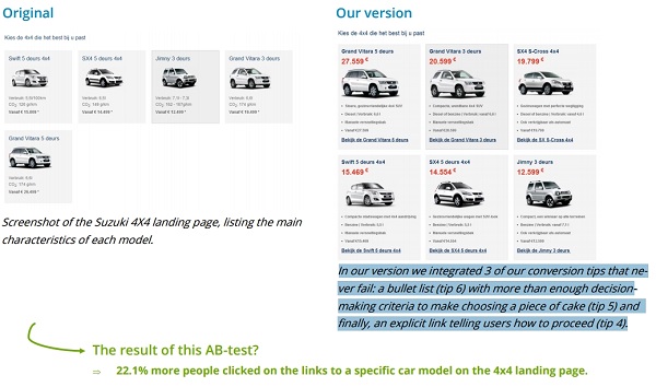
Перед вами скриншот целевой страницы Suzuki 4X4, на которой перечислены основные характеристики каждой модели.
В результате применения к ней 3-х из описанных выше техник (маркированный список, достаточное количество критериев принятия решения, и, наконец, четкая ссылка, говорящая пользователям, что делать дальше) количество переходов на страницы с описанием машин возросло на 22,1%.
По материалам: agconsult.com, image source: 鯨.w, http://lpgenerator.ru/blog/2016/10/20/10-tehnik-uvelicheniya-konversii-kotorye-podojdut-lyubomu-lendingu/#ixzz4Pb4Gm69N


