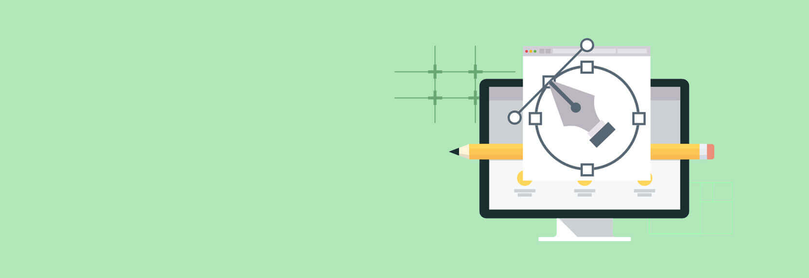
8 SecretsUniversal Web DesignPrinciples
Crafting an outstanding, custom web design is incredibly challenging. It demands not just technical expertise and experience, but also a refined artistic taste. While there is no definitive checklist of rules you can simply memorize to build perfect websites, there are overarching UI/UX guidelines. By adhering to these web design best practices, you can avoid critical layout mistakes and achieve results that are both aesthetically pleasing and financially rewarding.
Below are 8 essential web design principles you need to know and follow when creating and subsequently promoting your website.
1. The Rule of Thirds
The rule of thirds states that an image looks most compelling when its subjects or distinct areas are divided by imaginary lines that split the image into thirds—both vertically and horizontally.
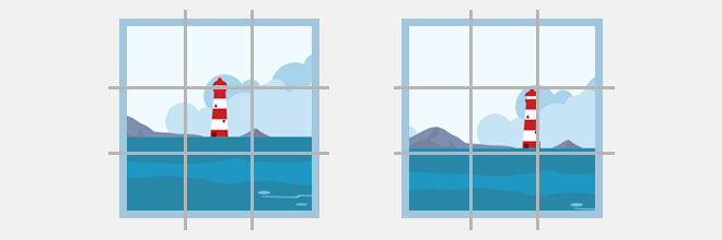
Does this mean you need to worry about perfectly aligning every significant element with these intersections? Not necessarily—it is merely a rough visual guideline. The most crucial takeaway is to avoid placing your primary subject or focal point directly in the dead center of the frame.
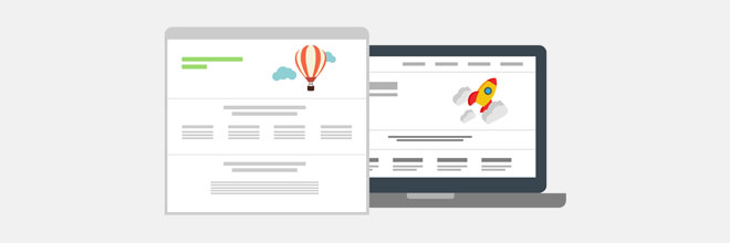
2. Visual Hierarchy
Through a well-structured visual hierarchy, you guide the visitor's eyes exactly where you want them to go, such as to your call-to-action buttons. Looking at the elements in the picture below, you will undoubtedly notice the large element first, and only then the smaller one. This fundamental concept is the core of visual hierarchy in UI design.
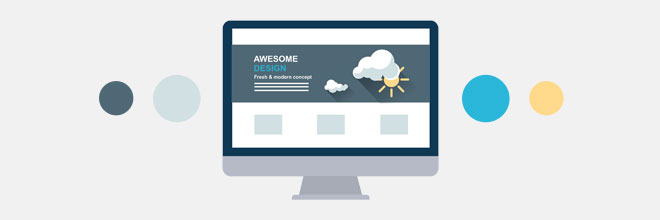
These are the exact UX methods you should use to influence—in a positive sense—your website visitors. In doing so, you intuitively direct the user, guest, or customer to the specific part of the site where a target action is planned, encouraging them to convert.
3. Fitts’s Law
The larger an object is, the less time it takes for a user to click on it!
This means you shouldn't try to save space by making interactive objects too small—it will be much harder for the user to accurately hit them with a cursor or tap them on mobile. Instead, you need to make target-objects reasonably large so the cursor hits the mark faster. However, this does not mean that bigger is always better. A button that takes up half the screen is rarely a good UX idea.
To put it into real-world terms, it is much easier to point at a coin than a freckle, but pointing at a house versus a massive residential complex makes virtually no difference. So, the next time you optimize your website layout using Fitts’s Law, remember that if a link or button is already large enough, increasing its size further won't speed up user interaction. At the same time, even a slight size increase for tiny text links can significantly improve usability.
4. Hick’s Law
Hick’s Law dictates that every additional choice increases the time required to make a decision. You have likely experienced this decision fatigue thousands of times at a restaurant. If a menu has too many options, it is difficult to make a choice and settle on just one dish. If you only have 2 options to choose from, the decision-making process takes significantly less time.

The more options available to users on a website, the harder it will be for them to navigate (or they might abandon the site altogether). Therefore, to improve the user experience, you must reduce the number of choices. If you run an eCommerce store selling a large number of products, be sure to add smart filters so visitors can make purchasing decisions with ease.
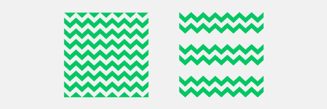
5. Law of Common Fate
Elements moving in the same direction are perceived as a related group. We mentally perceive objects as lines moving along a shared path, naturally grouping items that share the same trajectory and direction.

People subconsciously group parallel lines or raised hands together because they point in the same direction. Leverage this psychological principle to draw the user's attention to a specific element (for example, a newsletter subscription form, special offers, etc.).
6. Clean Web Design
The main characteristics of clean web design include:
- A rigid, well-organized page grid
- Excellent typography and readable fonts
- A limited, cohesive color palette
- A consistent visual style for all images and graphics
When developing a clean website design, do not be afraid to add necessary elements. Clean design doesn't mean a page should be empty; it means everything present must be arranged in perfect logical order. Furthermore, always strive to iterate and improve your layout. You can constantly A/B test different fonts, accent colors, and other UI components, which can ultimately yield a much higher conversion rate than your initial draft.
7. Law of Proximity
Parts of a visual composition that are located close to one another tend to be perceived as a unified whole. Consequently, the closer two shapes or text blocks are placed together, the stronger the tendency for the human brain to group them.
In web design, this rule works simply: elements that logically have nothing in common should not be placed near each other, preventing them from being seen as a single unit. Conversely—if we want to convey a sense of unity and related content, we must place those specific elements in close proximity.
8. Law of Similarity
Objects can share any number of visual characteristics: color, shape, texture, size, and more. When a viewer notices identical traits among elements, they instantly group them together based on these shared features.
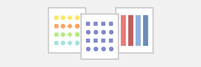
The most obvious example of the similarity principle in web design is the color of hyperlinks. Traditionally, text links follow a strict pattern: blue color and an underline. This significantly simplifies text perception and site navigation for the user: once they identify what a clickable link looks like, they will continue to recognize other links based on those exact visual cues throughout the site.
Of course, strictly applying these, or any other rules, is not absolutely mandatory in every single situation. Sometimes, by intentionally breaking them, you can achieve far more engaging, innovative, and visually stunning results. Experiment, be bold, and try arranging your page layout differently, even if it goes against all the conventional UX guidelines you have learned so far.


