
Simpler is Better
In one of his books, Barry Schwartz explains in detail why “more” actually means “less”. Yes, you read that right, and you probably disagree. After all, a wide range of choices supposedly gives you a sense of freedom, allowing you to pick the absolute best product. But is that really the case?
More Means Less
Logically, when faced with multiple options, a person should choose the one that suits them best. Unfortunately, this is far from the truth. When given a massive selection, people rarely choose the best product. Instead, they settle for what is easiest to evaluate and understand. Have you ever noticed that during an election, when casting a vote for a politician, almost no one remembers their actual campaign platform? We remember the core message the candidate delivers through various marketing channels: TV commercials, newspapers, billboards, websites, and email newsletters. All of this shapes our choice, regardless of our previous sympathies.
Let’s look at a completely different example. Many people know that installing a manual transmission in a car offers numerous advantages. But in reality, nobody cares. An automatic transmission is much easier to use and causes fewer headaches. Why even bother with a manual in that case? People love comfort, and often they will choose an option that doesn't entirely suit their specific needs simply because they are used to it and see no reason to step out of their comfort zone.
The exact same principle applies to website UI/UX design. Most developers design for a hypothetical user who will carefully browse the products and make a conscious, highly informed decision. This approach is fundamentally wrong. Why? Because every single day, we make a huge number of decisions that are far more important than this. Naturally, to create a high-converting landing page, you don't need to list every single pro and con of a product. You just need to provide the exact information the average visitor expects. Do that, and your project is destined for success.
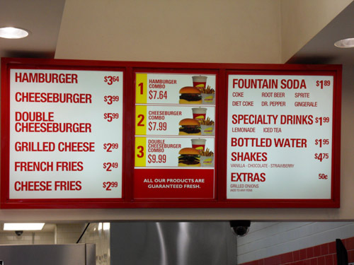
There is a fantastic fast-food chain in the US called In-N-Out Burger. While it might not be famous globally, anyone who has visited the States knows a story or two about this place. Their entire concept is built around an extremely limited menu. You can choose a hamburger, a cheeseburger, or a double-double. Add some french fries and a drink, and that’s it. The entire assortment ends there. At first glance, this might not seem like the smartest marketing strategy. However, practice shows otherwise. The restaurant is just as popular, if not more, than other massive fast-food chains. Its appeal lies in the fact that customers don't have to suffer from decision fatigue, wondering which burger to eat today or whether to add an ice cream, a pie, or a muffin to their order.
An even stranger concept to many is the online store woot.com. Every day, they offer just one single product, and visitors must decide whether to buy it now or wait for tomorrow's new deal. Sounds absurd, right? In reality, for a seller, there is no difference between selling 10 identical items today or 10 completely different ones. And if such a bold marketing tactic generates a massive flow of customers and boosts conversion rates, why not use it?
Essentially, this is the core philosophy behind effective landing pages. They are user-oriented, meaning they must deliver exactly the information the visitor anticipates. The rule of thumb is: the simpler the page layout, the higher the conversion rate. Its primary goal is to motivate the user to take a specific action. Therefore, if your goal is to persuade a visitor to sign up, you don't need to brag about how great your content is. Just mention that registration requires no personal data, takes only 30 seconds, and doesn't commit them to any spam newsletters. And “voilà!”, the client is in the bag.
More Doesn't Mean Better
Here is a fundamental truth you need to remember: no one will ever choose a more complicated software or service over a simpler one, even if it has more features. There is simply no justification for it, because, as a rule, all those extra options have zero impact on the daily activities of most users. Very few people actually need expanded functionality at the expense of usability. This doesn't mean you shouldn't innovate. It just means you must understand that you will have to work incredibly hard to prove to your visitors that they genuinely need these features and convince them to go through the hassle of learning them.
Jared Spool recently conducted a fascinating UX research study on this topic. It’s a common belief that geeks strive to dive into all the settings of any application and fully customize it for themselves. Well, the expert proved that such power users make up only about 5% on average. The overwhelming majority simply want to use the app without getting bogged down in the details.
The experiment involved hundreds of people sending their MS Word config.ini files to Jared, which he and his team then analyzed. This file stores data about all the custom settings of the popular text editor. They created an algorithm to check how many people changed at least one of the program's 150 options and exactly which parameters were modified. The results were staggering: 95% of users preferred to just use MS Word, keeping the default configuration completely untouched.
Naturally, it is very convenient when developers offer flexibility in settings. But the primary goal must always be to create a working product right out of the box. Every user subconsciously believes that the default settings are the optimal ones. If they start thinking otherwise, the entire project is doomed to fail.
More Means More Complicated
The paradox is this: the more options a user is offered, the harder it is for them to make a choice. Here is a simple example. Imagine a tasting shop. It offers 6 flavors of jam, each unique in its own way. You can only choose one. Now, imagine a second shop. You still only have one choice, but now you have to pick from 20 different jams. Much harder, isn't it? The fear of making a mistake, weighing the pros and cons of each jam—all of this subconsciously affects our decision-making. A vast selection does not simplify the choice. On the other hand, a complete lack of choice steals a piece of the freedom that people feel they possess.
It is crucial to find that exact golden mean.

Take Apple, for example, a company that releases only a couple of new gadgets every year. Let's look at their most popular product—the iPhone. If it were released in only one single variation, the brand's position in the smartphone market wouldn't be as rock-solid. On the flip side, if the developers added another color to the existing lineup and offered five storage capacity options instead of three, choosing an iPhone would become quite a difficult task for the buyer.
It is always easier to work and live under certain constraints. If your possibilities are truly endless, and you receive an order for a landing page design with the brief “just make something you like”, you will endlessly strive to make it better and better, never finishing. Having constraints gives you boundaries, which simplifies decision-making and makes the design process much more comfortable and efficient.
The Perfect Solution Lies in the Nuances
If you know how to create a simple product that dominates the market, you are invaluable. The lpg.tf platform can help you with this, acting as a highly premium landing page builder. Always remember that even if a person thinks about something for a whole day, a month, or even a year, the final purchasing decision is made in a split second. Therefore, the key objective is to narrow down the user's focus. The reason is that this specific decision won't be the most important one they make today, and they shouldn't have to overthink it.
This means that a web design which can be evaluated at a single glance will be the most highly functional. Short headlines, SEO-relevant keywords, one single call-to-action, and plenty of whitespace—all of these elements directly contribute to lead generation and customer acquisition. Why overcomplicate things? You can simply use lpg.tf and launch high-converting landing pages one after another!


