
Lead Generation Contact Forms
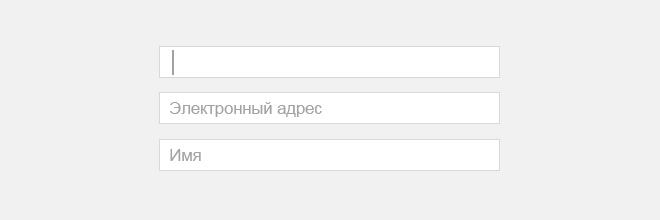
An effective opt-in or lead generation form is a highly valuable tool for user engagement. Properly designed contact forms are incredibly versatile. They work flawlessly for interacting with loyal customers, first-time visitors, and can even capture the interest of users who are initially skeptical about your website or offers.
But how do you determine the effectiveness of your subscription forms? And how engaging are the contact forms on your landing page? Only the users themselves can answer these questions. Extensive research has been conducted on various lead capture forms, involving surveys of a massive number of website visitors.
Based on this collected data, we can clearly see how boosting your website's conversion rate directly depends on the specific types of lead generation forms you use.
Many conversion rate optimization (CRO) experts try to explain exactly how to create opt-in forms that will immediately and dramatically skyrocket your website's conversions. While some of these best practices have been known for a while, they are shared with good intentions and address serious, foundational marketing questions.
For example:
- Does your industry or business niche impact your website's conversion metrics?
- Is there an optimal time of day when form submission rates peak?
- Can you develop a proven formula or algorithm for a highly converting lead generation form based on clear logic?
- How should you design and write your Call to Action (CTA) button?
These questions concern many website owners and SEO specialists. To find the answers, we can look at the Lead Form Conversion Report, which was compiled by interviewing nearly 400,000 visitors.
By leveraging the findings of this report, you can gain a comprehensive understanding of how to build a successful opt-in form, design an appealing UI, and understand its direct impact on increasing conversions for your specific website. Let’s dive into the key takeaways and most common questions.
Does the Number of Form Fields Really Matter?
According to the research — yes, but not exactly in the way you might think.
CRO specialists consistently state that the optimal solution is keeping the number of fields in a lead capture form to an absolute minimum. This is true, but alongside this factor, the type of the opt-in form plays a massive role.
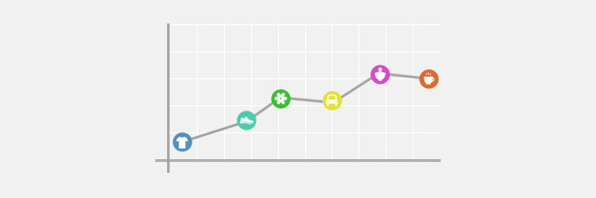
According to FormStack's report, checkout page forms contain an average of 19 fields, which are fully completed by only 6% of visitors. Conversely, forms for contest entries or surveys are filled out much more actively — 28% of users will leave their contact details, meaning the conversion rate of these pages is significantly higher.
When designing a contact form, marketers must balance the amount of information requested from the user with the value of the content or offer provided. The exchange must be fair and equal.
How Does Your Industry Affect Conversion Rates?
A "good" conversion rate can only be defined relative to a specific business niche. The report data shows that a conversion metric considered highly successful for one industry might be extremely low for another business sector.
However, when looking at statistics, there is always a margin of error and potential contradictions, as the results heavily depend on the specific audience demographics of the surveyed users.
Peak Times for Form Submissions

The period of highest user activity depends on the form type. According to the study, the peak load for survey completions occurs in the morning, participation in contests interests people around lunchtime or closer to the evening, while standard lead generation contact forms are most frequently filled out late at night.
Building Logical Contact Forms

Creating a "smart" conditional logic form will motivate visitors to complete it by offering to answer questions that are genuinely interesting and relevant to them. Relevant questions significantly boost website conversions.
Designing Call to Action (CTA) Buttons
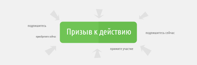
It’s not a given that leads will click on buttons just because they like the text. Sure, labels like “subscribe”, “buy”, or “participate” sound decent. However, it is much better if the button contains a strong, clear call to action. Add the word “now” — it works wonders — or change the phrasing to action-oriented verbs like “sign up”, “get yours”, or “join in”.
You can also combine these elements, for example — “Subscribe now”. Not only does it sound much more compelling than a simple "subscribe", but it also noticeably improves conversion rates. If the wording on the button is not entirely clear, you must specify nearby exactly where clicking the button will lead.
For example, “By submitting this request, you will be redirected to the payment page.” You should proactively avoid any user frustration caused by the unfulfilled expectations of a visitor who just submitted a form.
Now, put this theory into practice using your own landing page with our lead capture form builder.


