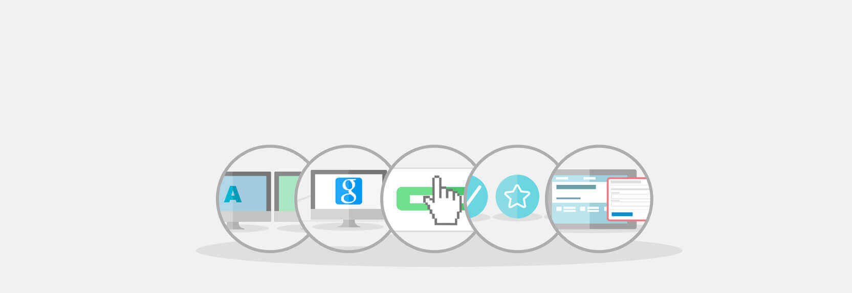
Website Landing Page. 5 Tips for Improvement
No matter what kind of landing page you need, creating one doesn't take much time or effort for almost any Internet user. However, to make it effective, you must implement several key elements. The conversion rate (CRO*) of a website's landing page is influenced by specific features, such as the design of key elements and thoroughly prepared content.
In this post, we will share several tips capable of turning an average page into a landing page with a high conversion rate.
1. Testing and Practice

The best practice for increasing CRO is making constant changes to the landing page. You can conduct these yourself using the effective landing page platform Lpg.tf or by consulting the service's specialists.
By using the A/B testing method, you can understand which elements increase conversion and which should be replaced or fixed. It is impossible to imagine working on conversion optimization without testing, and it is guaranteed to yield positive results.
2. SEO** is More Important than CRO

The conversion of your landing page won't yield the desired effect if it doesn't receive traffic. Therefore, you must always include SEO promotion in your internet marketing strategy. Make sure to handle SEO promotion first, and only then proceed to improve CRO.
Knowing where visitors come to your site's landing page from allows you to precisely tune its content for specific keywords or a suitable advertising offer (ad).
3. Make the Call-to-Action*** Obvious
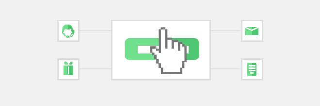
A landing page will not provide the expected return if its visitors do not perform a specific action—calling an operator, ordering a product or service, subscribing, registering, etc. Your website's landing page must unambiguously lead potential clients to the second step.
In the page design, this can be expressed through the size and color of the order button—it should be large and contrast with the landing page background, but under no circumstances should it interfere with the user studying the information on the site.
It wouldn't hurt to pay more attention to the text on the button itself—study some good examples to come up with a suitable one for your landing page. Here are some effective inscriptions: “Get your free trial version of the program right now” or “Download your copy right now”.
At the same time, it is better not to use vague wording such as “confirm”.
To reduce uncertainty regarding the chosen button text, it is best to use it only once on the landing page, but in the most appropriate place (after the description of the advertising offer).
4. Highlight the Benefits of the Offer to Visitors

Marketing and business as a whole are becoming increasingly customer-oriented. People are interested in cooperating only with companies that can offer them something special.
Based on this trend, it would be a good idea to create a landing page in such a way that the benefits of the product or service are visible immediately upon entry.
A second option for focusing attention on the exclusivity of your promotional offer is to express it in the text on the button itself. Using one of these solutions will not only attract the attention of potential clients but can also increase your brand awareness.
5. Use a Simple and Short Contact Form

With a simple and short contact form, a landing page will be more effective, as visitors do not want to fill out a multitude of fields.
Voluminous forms will, of course, provide more information for marketers to analyze, but at the same time, they will lower the CRO value. To start, it is quite enough to use just one method of contact with the visitor and only later, if necessary, ask them to provide additional information.
The form questions themselves should not scare guests or distract them. A maximum of three fields for entering personal information with traditional questions about contact details can increase the conversion of the landing page, the creation of which already entailed quite a bit of trouble.
*CRO (conversion rate optimization) – the metric for optimizing conversion rates.
**SEO (search engine optimisation) – optimization for search engines.
***CTA (call-to-action) – an appeal to take action.


