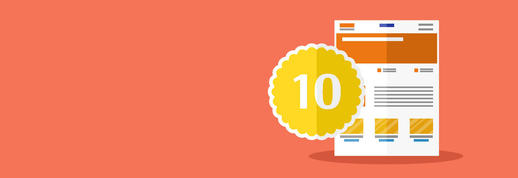
10 Improvements —It IsThat Simple
So, you’ve built a landing page, driven traffic to it, and now you are sitting there waiting for leads. But that’s not all. The ultimate goal of your landing page is to convert visitors into buyers. To achieve this, you need to create the perfect environment.
Before digging through the web in search of secret maneuvers to multiply your revenue and bring in leads, you first need to run through the fundamental principles.
These core principles can be divided into two main pillars:
- Design — (the candy wrapper) creates the very first impression. It must hook the user emotionally and draw attention to the call-to-action button.
- Copywriting — (the candy filling) is the text that engages the mind with facts and compelling arguments. It also drives the user toward taking a specific action.
Relevance
The golden rule: one goal — one page. Better yet, create many of them.
For example, if you sell furniture, create separate landing pages for home, kitchen, and office furniture. This ensures that when a user lands on your page, they think: “Oh! This is exactly what I was looking for.”
If I am searching for a new bedroom wardrobe, I want to see a website featuring home furniture, not glass whiteboards for offices.
This exact rule applies to your ad copy. Your promotional messages must absolutely match the content of the landing page they link to.
Meeting Expectations
Hot Brazil, Rio de Janeiro, the carnival. You meet a stunning woman and spend the whole evening walking together. And suddenly it turns out that she is a he.
Disappointment, frustration, despair.
No one likes unmet expectations.
Fulfill the expectations of the user who clicks on your ad. Make it appropriate and highly relevant to the site.
A consistent corporate design, slogan, and logo present in both the ad and the landing page will greatly help you achieve this.
Powerful Copywriting
Imagine walking home, stepping out of the subway, and passing a newsstand. A headline has only a fraction of a second to grab your attention. But if it manages to spark your interest, there is a good chance you will stop and buy that magazine. Right?
Make your headlines relevant and clear. A headline must be catchy, because it alone decides whether your content will be read or ignored.
Headlines and subheadings are just as critical as your call-to-action. It is highly recommended to apply at least one of the persuasion techniques in your headline.
Cut the Clutter
Keep only the most vital information on the page. Absolutely nothing should distract the visitor from the target action.
Everything depends on you and your specific business niche. Define your goals and ruthlessly eliminate elements that steal the visitor's attention away from converting.

You have already paid for the visitor to land on your site, so make sure that investment pays off.
Keep It Concise
There is a global trend to shorten everything. Nobody wants to tackle long reads.
It’s almost as if people in the modern world are lazy dummies who will only read trimmed, short-form texts. Just like on Twitter.

Perhaps a shortened landing page has helped someone out there. But if you are selling a high-ticket product, your visitor needs much more detailed information to build a strong level of trust.
A/B testing shows that long-form landing pages are often more effective.
Scrolling
Conversely, landing pages that are far too long can scare off the user. Analytics show that the bulk of attention goes to the first screen (above the fold). Therefore, the most critical information about your product and company should be placed at the very top.

Call-to-action buttons should be placed on every screen or made sticky. You never know at what exact moment a visitor will decide to buy. Your job is to ensure they don’t change their mind while hunting for the button.
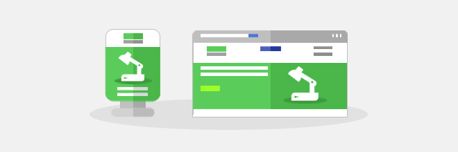
Emotions
All design elements must seamlessly reflect your brand's core values.
A good logo is one the visitor remembers from the first glance and easily recognizes later. This is an essential landing page component that must convey personality. A logo either reveals the entire essence of the company or ruins everything.

It is also highly advisable to use high-quality images that directly relate to your business theme.
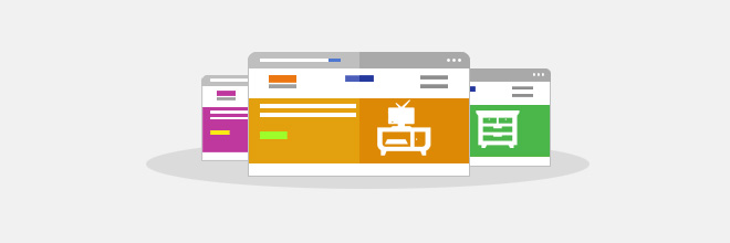
Content
Experiment more with different types of content. Video is widely considered the most effective format.
Unfortunately, video content has one drawback: it doesn’t suit everyone.

For example, a GoPro landing page overflows with emotion, captures attention, and simultaneously demonstrates its brand positioning and lifestyle — living life on the edge, being a hero.
But if your product doesn’t genuinely need a video review, it’s better not to clutter your landing page's free space.
Social Sharing
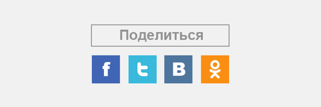
Social networks significantly influence search engine rankings. Therefore, "Share" buttons are a must-have element on your landing page. Moreover, they will increase brand trust and bring in additional traffic from social media platforms.
A/B Testing
The placement of page elements, images, and forms — everything plays a role. And if you have a hunch that changing the snowflake icon next to your call-to-action button to a little dinosaur will boost your conversion rate — test your idea!

Everyone is searching for the golden formula. The ultimate quintessence of marketing tactics, psychological manipulation, and design hacks. A transparent button with gray text and a bold red arrow pointing at it in the top left corner of the F-pattern reading zone, boasting a 100% CTR.
Unfortunately, such a miracle does not exist, and the only proven way to know what works is through relentless testing.
Conclusion

Landing page optimization is a comprehensive marketing strategy. Every single element on the page must fulfill its specific role, guiding the visitor by the hand step-by-step toward a purchase. For a highly successful landing page, you need a solid strategy and clearly defined goals. Wishing you massive conversions!


