
Have you been making these 7 monstrous
landing page mistakes?
What do you think requires more attention: driving traffic or optimizing your website?
Before answering, think about the primary goal of a landing page. Exactly—to turn visitors into buyers.
You might think your landing page is a brilliant lead generation trap. But that’s just your subjective opinion, even if you are a marketing pro. Finding out what visitors actually think about your page is no easy task, especially for large companies. As a result, optimizations are often based purely on intuition.
In this article, you will discover the most common landing page mistakes and learn exactly how to fix them.
Unclear call to action
Imagine what a visitor thinks when they arrive from an ad campaign and see your page for the first time.
If your images don't match the product or service, your bounce rate will multiply like mushrooms after the rain.
The button is also critically important. No design and no AIDA framework will help if your call-to-action button is hidden in a blind spot.
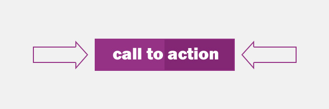
What to do: place your main button in the most prominent spot, add an image of a person looking directly at the button, or enhance the visual focus with an arrow pointing to it—let your imagination run wild!
Pay attention to the visual hierarchy of attention. The CTA button must be not only large but highly noticeable, standing out from the rest of the page content. Therefore, the fewer distracting elements drawing attention away from the main target action, the better. Simpler is better.
Overwhelming product assortment
An overload of graphical elements, massive text walls, and a lack of clear “hints” on what to do next will scare visitors away. Graphics should assist the user, not act as a roadblock to completing the target action.
What to do: don't dump all your information on the visitor at once. You need to gradually prepare them for the next step in your sales funnel.

If you give a customer too much freedom of choice, they won't be able to make a decision and will simply leave the site. People find it hard to make choices and decisions; in most cases, they don't even know what they want. You must present an offer that limits their options. A decision will be made much faster—and your conversion rate will skyrocket.
More means more complicated. Every extra choice is an abyss, an obstacle, a complex task. So, do this hard work for the visitor, and they will thank you with a purchase.
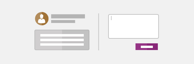
Too many form fields
Gathering maximum data about your clients and refining your target audience boundaries is, of course, a great idea. But think about those poor users who carved out a minute of their lives to buy your product or service, only to be met with an endless sea of required fields.
In the best-case scenario, they will think, “When will this ever end?” and nervously fill out your fields. In the worst case, they will bounce off your page, fill out two simple fields on your competitor’s site, and be perfectly happy.
The total number of these forms on your page matters, too. Keep them to a minimum. Only the form with your main call to action is truly important. Extra fields for leaving reviews, subscribing to newsletters, or clicking external links are essentially useless content that distracts from the primary goal.
What to do: leave just one—the most important—form. You can ask for reviews or newsletter subscriptions later. It is far more critical that the visitor leaves their contact details now.
Minimize the number of required fields. Often, just a name and an email address are enough. Even then, studies show that users aren't very fond of sharing their names; they are much more willing to leave a phone number.

As an alternative, you can create a single-field form asking only for a phone number. You can then call them back to gather the rest of the information. However, since not everyone has time for phone calls, an email field is highly recommended. You can often find out their name before calling by searching the phone number online.
Form fields are a highly debated topic, and no one can predict exactly how they will perform. It may depend entirely on your target audience or business niche. Only A/B testing will give you the definitive answer. Just remember that the “less is more” rule will always be key in any situation involving web forms.
Too much text
When a visitor lands on a website, they expect simplicity and clarity. It’s no secret that people on the internet don't read articles—they scan them. The web is a fast-paced environment where users are constantly rushing. If they have to sit on a page reading a wall of text, they feel stagnant and left behind. Internet users love feeling energetic and fast.

Heatmaps from eye-tracking studies show that visitors scan web pages in an F-shaped pattern. Many users read diagonally or skip from word to word.
Font style and size are also crucial.
What to do: don't write too much copy. Keep only the absolute essentials: the offer, why it’s beneficial, and information about delivery and deadlines. This is more than enough for a visitor.
Use sans-serif fonts sized 12–14 pt or larger.
Broken promises
A disappointed user is bad for business. If you promised something, deliver it. It is absolutely terrible when your ad copy doesn't match the content of your landing page. The person will start looking for that specific offer described in the ad, and before you know it, you’ve lost their trust. The user feels deceived. In such cases, the chances of making a sale drop to zero.
What to do: double-check your ad campaigns and promptly remove information when a promotion has ended. The content of your ads must perfectly match the content of your landing page.
Visual distractions
Our brains are wired in such a way that, whether we want to or not, we instinctively pay attention to movement.
By using moving elements on your page, you distract the user from your call to action. The brain refuses to process so much information simultaneously, and the visitor may just leave the site. This is unlikely to have a positive impact on your revenue.

Pop-ups are a whole different story. They are inherently annoying—90% of visitors bounce when they are hit with a pop-up right at the beginning.
What to do: no matter how good your intentions are, an immediate pop-up at the start of a session ruins everything. They are only effective in the form of an exit-intent popup, which unobtrusively appears at the end of the session when the visitor has already consumed the main page information.
Don't attack users with an excessive amount of animations and sliders—they will run away.
Trust deficit
Have you ever visited a site that gave you a bad feeling, a sense of uncertainty? That happens for a reason. Perhaps you were repelled by a suspicious design or fake-looking ratings and reviews. Unfortunately, this is quite common.
When a brand has strong social proof, it works better than any advertising.
What to do: do not forget about trust signals. If you have reviews on your page, include a form so real users can leave their own feedback. Ensure your design looks highly professional.
Follow these simple rules, and your conversion rates will consistently grow.
Summary

By eliminating these gross mistakes, you will drastically increase your lead volume. Dedicate time to your landing page, experiment, and find new ways to attract visitors and boost conversions. It really is that simple. Our blog is here to help you along the way.


